Insights
From information to insights. Entering a new era of investment management
Insights
Want to challenge business as usual? Here you’ll find a collection of curated content on today’s leading topics, like ESG, data management, innovation and more.
Browse timely updates of market risk across a broad range of geographies and asset classes.
 Equity Risk Monitors
Latest trends in equity market risk.
Multi-Asset Class Monitor
Latest trends in and the impact on a global multi-asset class portfolio.
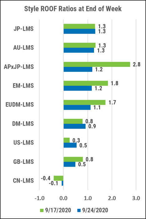
ROOF Market Sentiment
Review of investor’s risk sentiment, calculated using our Style and Sector multi-factor risk models.